Sections of this article are adapted from the article “Do’s and Don’ts of Poster Presentation,” by Steven M. Block, published in Biophysical Journal, Volume 71, December 1996.
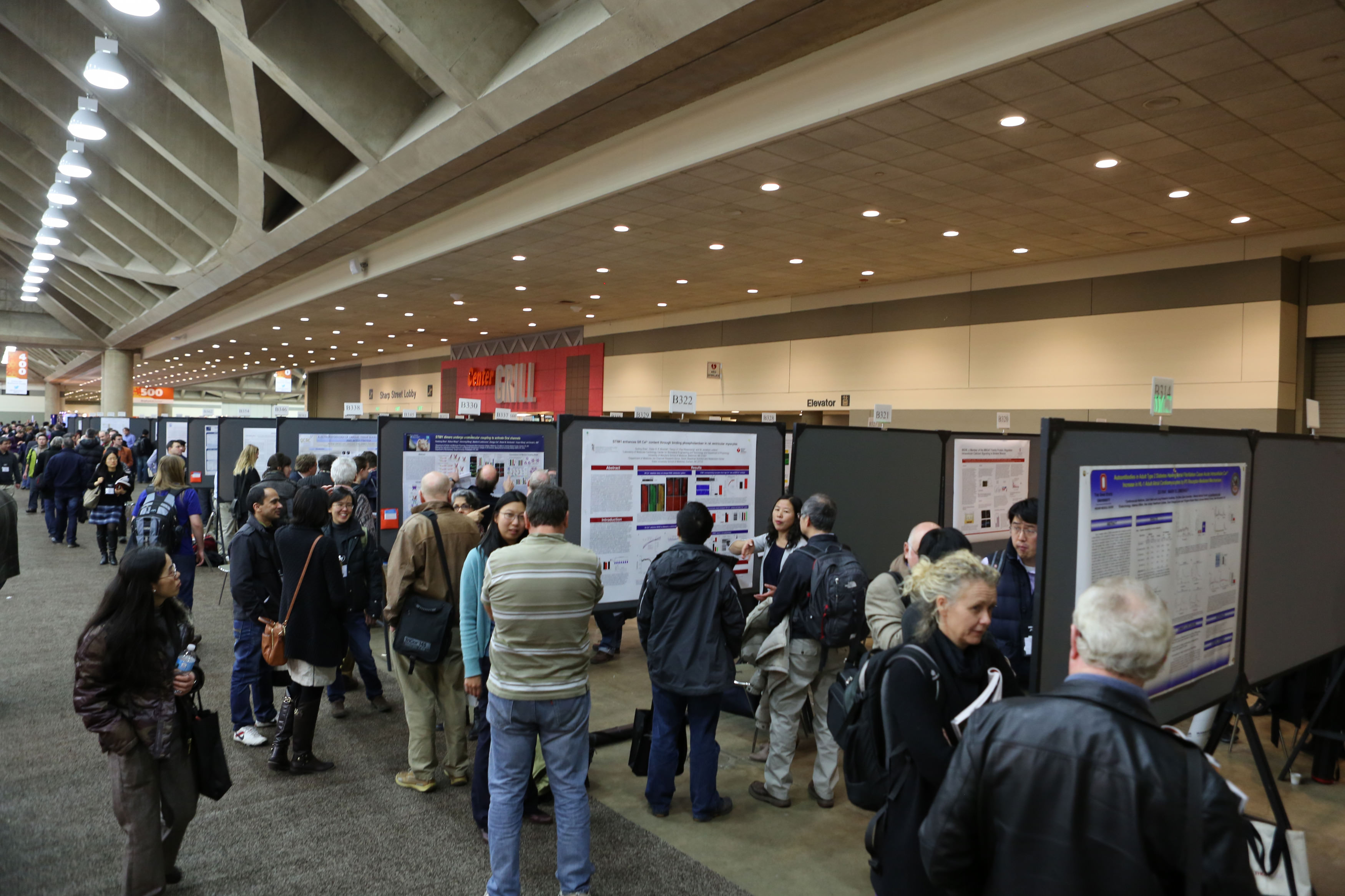
Congratulations! Your abstract has been accepted for the 60th Annual Meeting of the Biophysical Society and your poster has been scheduled in with thousands of others during the meeting. What do you do next? How do you prepare for the presentation? What can you do to stand out from the others? Even if this is not your first presentation, it is important to keep certain things in mind while preparing your poster and presentation.

First, consider how your poster will look—the size, colors, font, and flow of it. Think of your audience—people walking through the poster hall, glancing around for interesting topics. Most important on your poster is the title. The title of your poster does not need to match the title of your abstract. In fact, it’s best that it doesn’t. Your abstract title is probably long, incredibly descriptive, and possibly laden with jargon. But you are trying to attract people to come over and read your poster, so keep the title short, snappy, and to the point. Make sure someone can get a general idea of your topic just from reading the title – and make sure they can read the font from a reasonable distance.
Once you’ve lured readers to your poster, you want to make sure they can actually read the text you’ve so painstakingly put together. Fonts smaller than 12-point are just too small for a poster—14-point should be used as a benchmark for the absolute minimum font size (think fine print), and the main text should be 18-20 point or larger (the title should be even bigger). If your text doesn’t fit at that size, consider editing your text, not decreasing the font size. While we’re talking about fonts, keep in mind that poster presentations are not the right place to experiment with fun, fancy fonts (save those for e-cards to your Nobel Prize celebration!). Use fonts that are easy to read. If you want to move from the traditional Times New Roman, stick with something equally basic, such as Baskerville Old Face, Century Schoolbook, or Palatino Linotype. Make sure whatever font you choose works well with any equations or symbols you use. Once you’ve selected a font, keep your choice (and size) consistent throughout the poster.
You may want to draw readers to you by making your poster a bright color, or adding patterns or some other loud visual cue. There’s nothing wrong with a little color in your poster, but keep it professional (avoid neon hues, unless they’re relevant to your research), and keep it readable by making sure the colors contrast well—if you want a navy blue background, your font color should not be deep magenta.
Now that you’ve settled on the basic font, size, and color choices, it’s time to lay out your poster. Break your presentation into logical sections that easily flow from one to another, to help your reader follow your research. Start in the top left, moving vertically first, then left to right. Make sure to include any additional authors towards the beginning of your poster and any relevant references towards the end—it is very important to give credit to everyone involved!

With your poster finished, it’s time to prepare your actual presentation. You’ll want to stick around near your poster for as much time as you can to engage with readers, answer questions, and of course meet and network with other scientists interested in your research. Definitely plan to camp out by your poster for at least the hour that you are scheduled to present. Keeping in mind that most people will only stop for a moment, and even those who linger will only do so for three to five minutes, put together an “elevator speech” with the top points you want to make and practice it! To help develop your presentation, test it out on a colleague or labmate to get feedback on your clarity and delivery.
Engage curious parties in conversation, but be careful to not badger anyone, or to be too engrossed in any one conversation (thus ignoring everyone else). You can always schedule a follow-up with very interested individuals if needed. If you have them, bring business cards (or paper and pen) to share your contact information with anyone interested in follow-up.
If you come prepared with a well-designed poster, a few key talking points, and copies of any necessary ancillary materials, you can hang your poster and then let your science speak for itself!